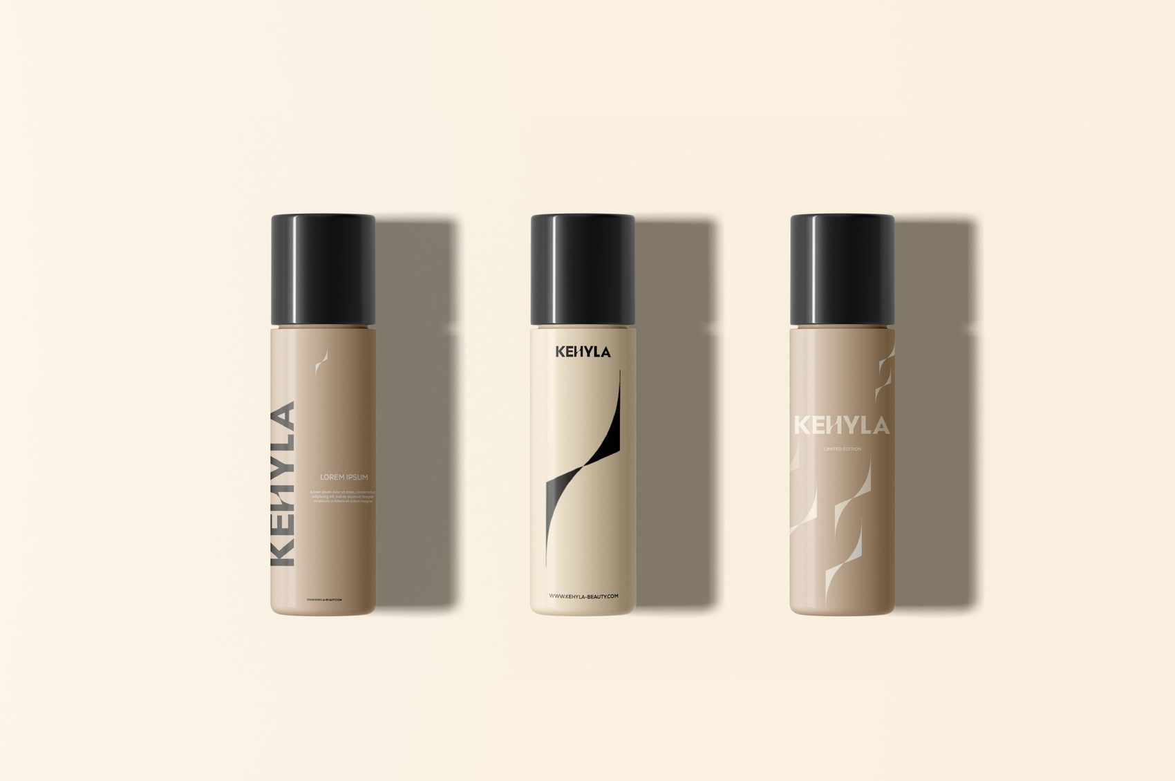
Brand Identity · Cosmetica Premium
Kehyla
Una bellezza che cresce con te: identità elegante e senza tempo per una cosmetica premium pensata per le donne over 40.
Kehyla enhances women’s authentic beauty with high-quality, elegant, and effective cosmetics.
We create timeless rituals for confident women who seek to feel secure and refined every day.
Rooted in authenticity, premium quality, lasting elegance, empowerment, and community, we are a premium brand for women over 40 - offering a warm, reassuring experience with a refined, empathetic voice, far from excess and close to what truly matters.
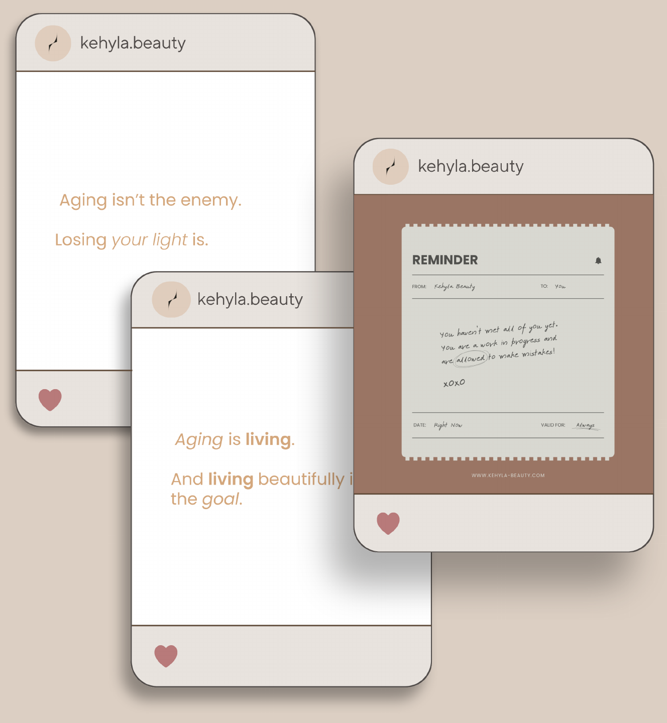
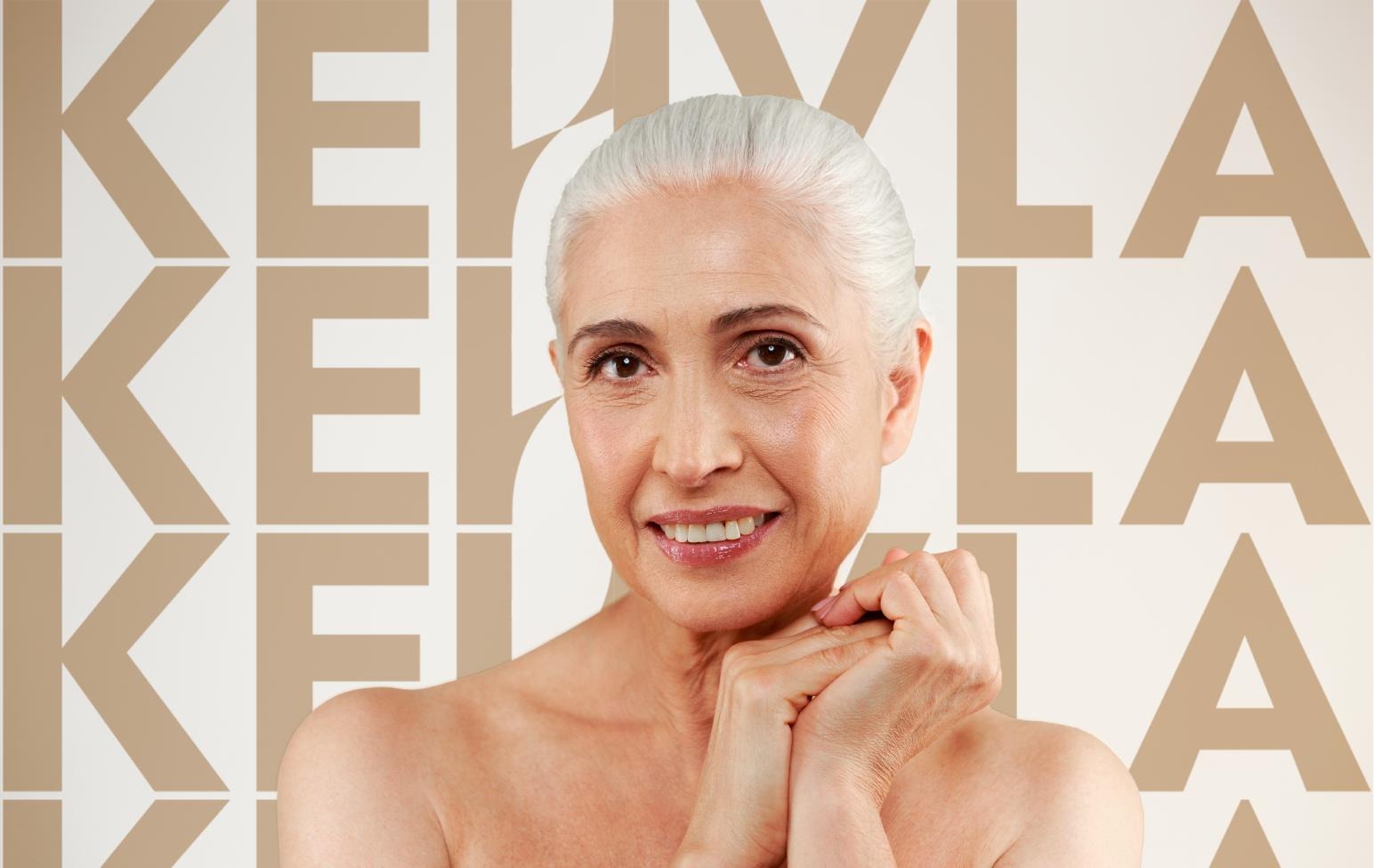
The Kehyla tone of voice is warm, elegant, and empathetic.
We speak to women like a trusted friend, with refined yet accessible language that inspires and reassures.
Every message reflects care, authenticity, and attention to detail, portraying beauty as a personal journey of moments, emotions, and timeless rituals.
Our words are chosen to celebrate the confidence that comes with age, to embrace individuality, and to encourage women to feel beautiful in every chapter of life. This voice is consistent across all brand touchpoints — from product packaging to social media — ensuring that every interaction with Kehyla feels personal, genuine, and memorable.
Beauty that grows with you
More years, more beauty
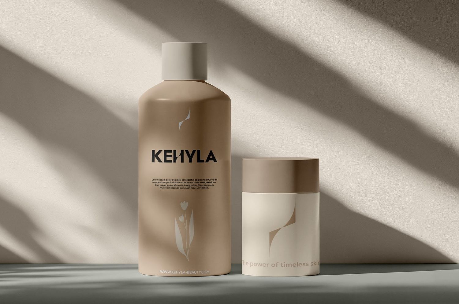
The power of timeless skin
Age beautifully, live fully
Elegance that stands the test of time
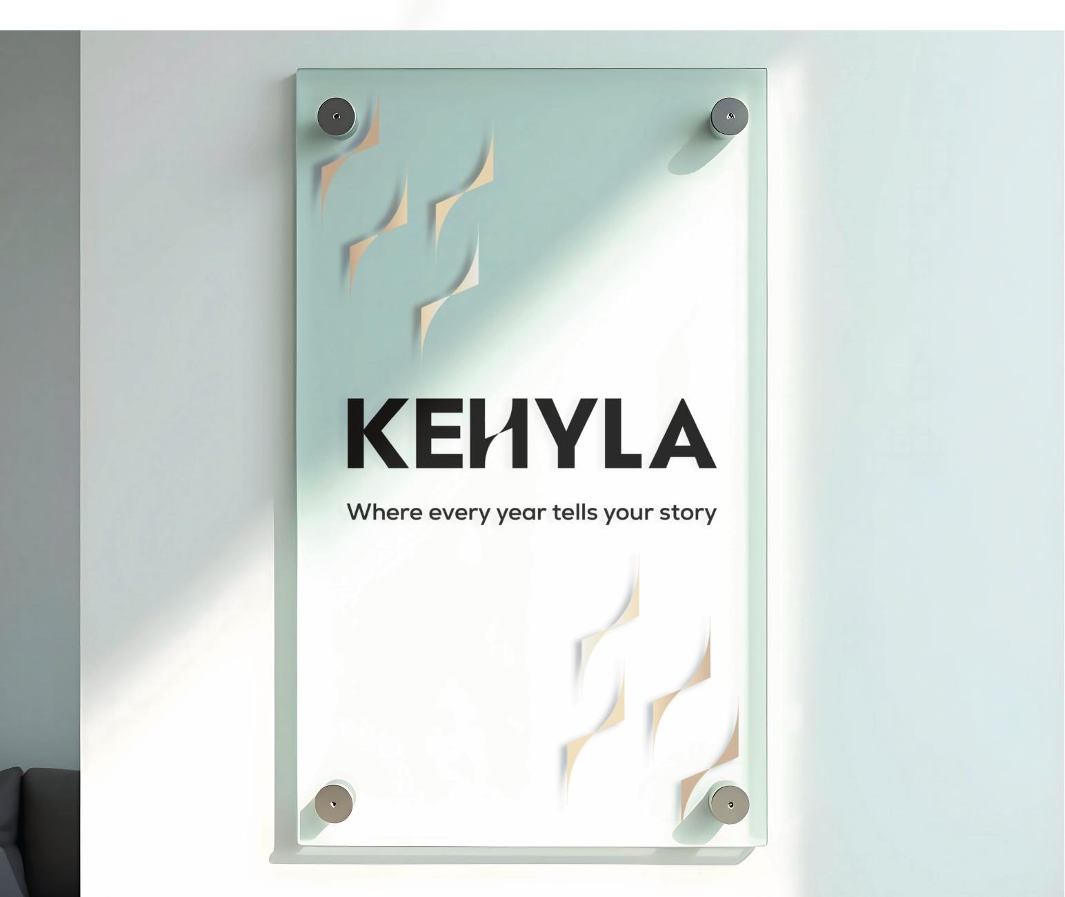
Where every year tells your story
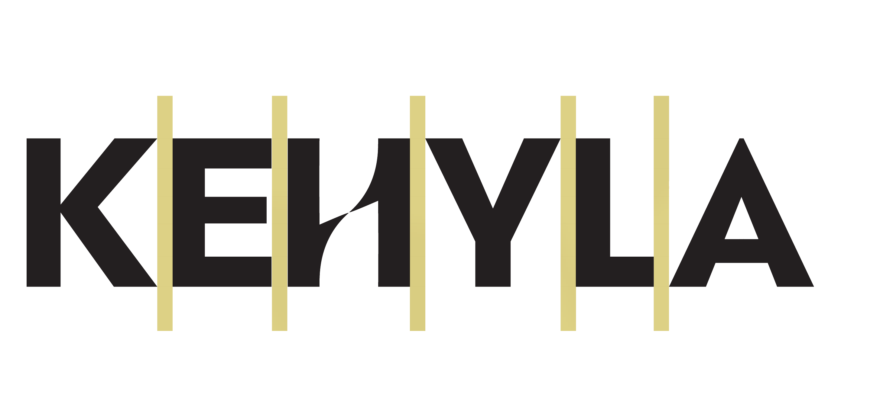
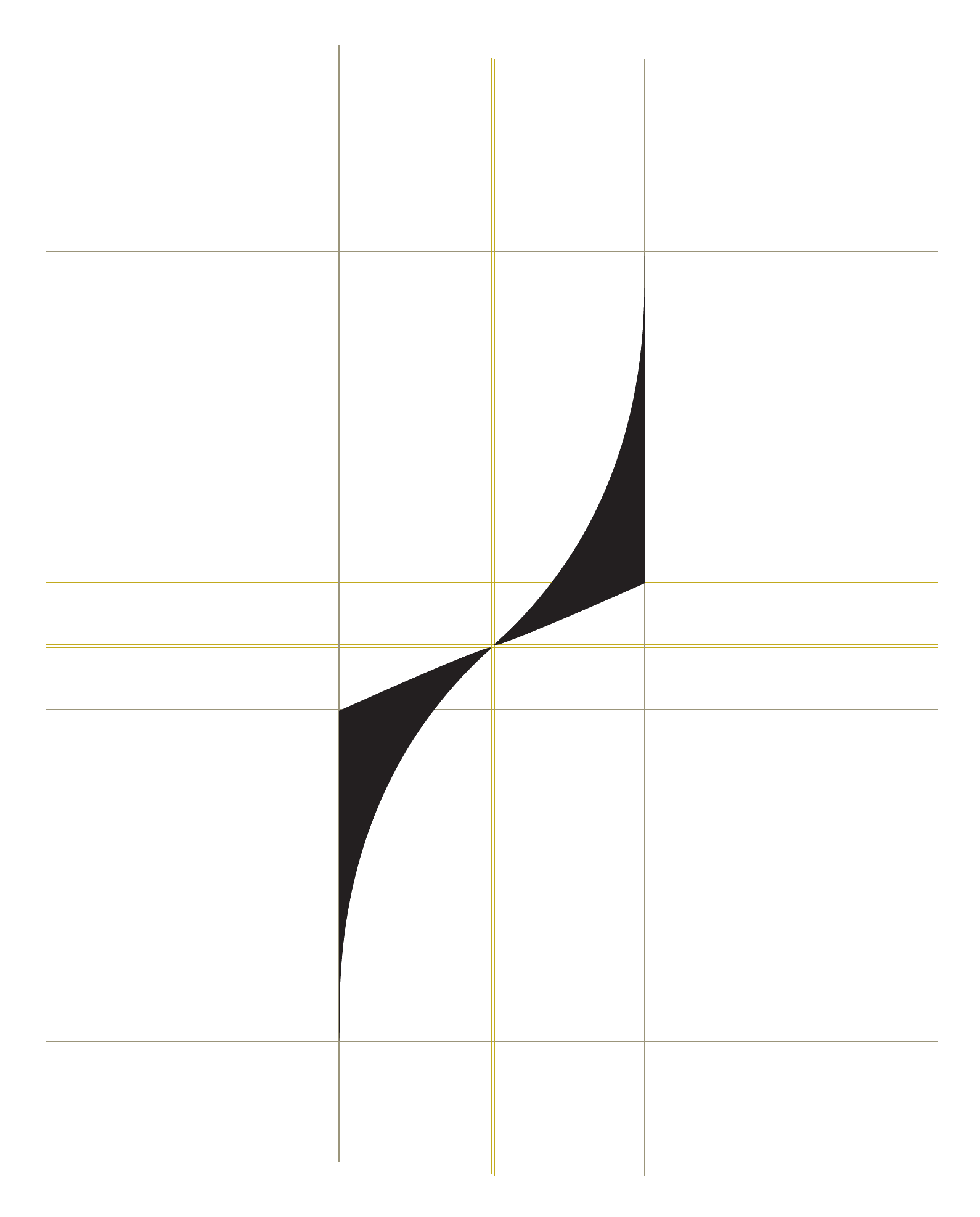

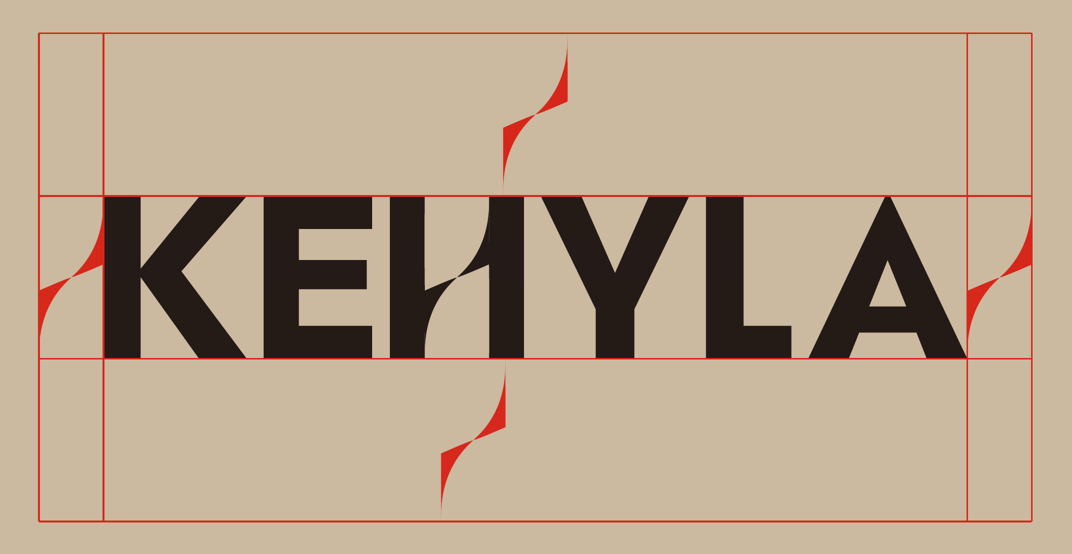
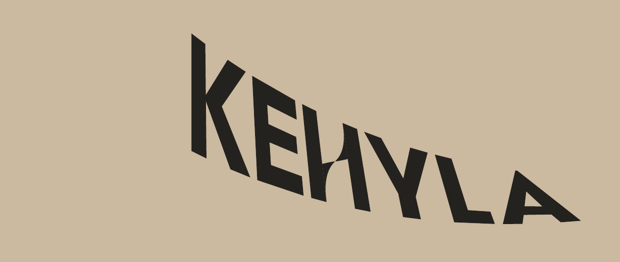
To ensure the Kehyla logo remains highly visible and impactful, it must always be surrounded by a minimum clear space. This area must remain free from any text, graphics, or other visual elements, preventing visual clutter and preserving the logo’s integrity. The clear space is defined by the height of the central element of the “H” in the logotype - the brand’s distinctive mark - and should be maintained on all sides.
For print applications, the logo should never be reproduced smaller than 2.54 cm (25.4 mm) in width, ensuring perfect legibility even on compact formats such as business cards. The maximum recommended width is 12.25 cm (122.5 mm), which maintains sharpness and balance on brochures, light signage, and cover designs.
In digital use, the logo should remain no smaller than 3.53 cm (35.3 mm) (approximately 100 px) to ensure clarity on web pages and social media posts. The largest recommended size is 51.05 cm (510.5 mm) (1447 px), which corresponds to the native file resolution and guarantees optimal display on high-definition screens without any loss of quality.
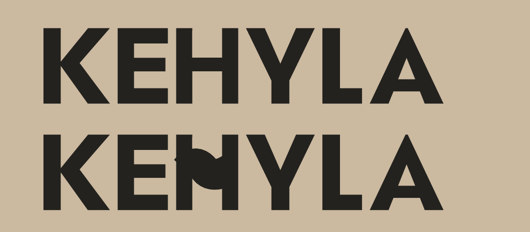
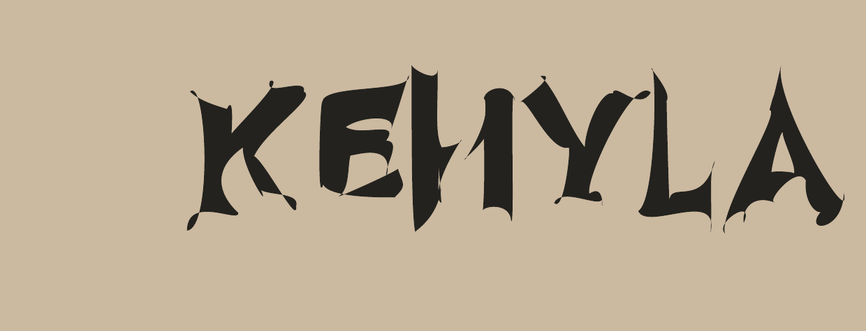
To preserve the integrity and recognizability of the Kehyla brand, the logo must always be used as provided. Any alterations compromise its visual identity and should be avoided.
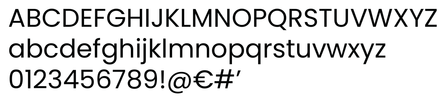
Poppins is the main typeface for Kehyla, used for long-form content such as product descriptions, information sheets, and corporate communications. Its clean, modern sans serif structure ensures optimal legibility in both print and digital formats. Recommended weights: Regular or Medium for body text, Bold for subtitles or emphasis.
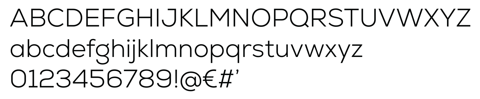
Nexa is used for secondary titles, subtitles, and highlighted text, creating a clear hierarchy with Poppins. Its geometric, well-structured design adds freshness and dynamism while maintaining stylistic consistency. Recommended weights: Light or Regular for subtle text, Bold or Extra Bold for callouts and standout elements.
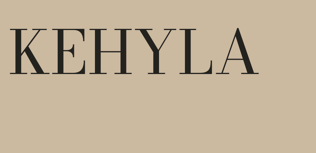
Ofelia Display is the accent typeface, reserved for main titles, campaign headlines, quotes, or decorative elements on packaging and social content. With its strong personality, it conveys identity and style but must be used sparingly for short, eye-catching text. Always pair with generous spacing and clean layouts to maintain readability and visual balance.